3D XYZ Graphs
3D Sequential Graphs
4D/Ternary Graphs
2D Categorized Graphs
Ternary Categorized Graphs
nD/Icon Graphs
Matrix Graphs
|
2D Graphs 3D XYZ Graphs |
3D Sequential Graphs 4D/Ternary Graphs 2D Categorized Graphs |
3D Categorized Graphs Ternary Categorized Graphs nD/Icon Graphs Matrix Graphs |
Categorized Graphs
One of the most important, general, and also powerful analytic methods involves dividing ("splitting") the data set into categories in order compare the patterns of data between the resulting subsets. This common technique is known under a variety of terms (such as breaking down, grouping, categorizing, splitting, slicing, drilling-down, or conditioning) and it is used both in exploratory data analyses and hypothesis testing. For example: A positive relation between the age and the risk of a heart attack may be different in males and females (it may be stronger in males). A promising relation between taking a drug and a decrease of the cholesterol level may be present only in women with a low blood pressure and only in their thirties and forties. The process capability indices or capability histograms can be different for periods of time supervised by different operators. The regression slopes can be different in different experimental groups.
There are many computational techniques that capitalize on grouping and that are designed to quantify the differences that the grouping will reveal (e.g., ANOVA/MANOVA). However, graphical techniques (such as categorized graphs discussed in this section) offer unique advantages that cannot be substituted by any computational method alone: they can reveal patterns that cannot be easily quantified (e.g., complex interactions, exceptions, anomalies) and they provide unique, multidimensional, global analytic perspectives to explore or "mine" the data.
What are Categorized Graphs
Categorized graphs (the term first used in STATISTICA software by StatSoft in 1990; also recently called Trellis graphs, by Becker, Cleveland, and Clark, at Bell Labs) produce a series of 2D, 3D, ternary, or nD graphs (such as histograms, scatterplots, line plots, surface plots, ternary scatterplots, etc.), one for each selected category of cases (i.e., subset of cases), for example, respondents from New York, Chicago, Dallas, etc. These "component" graphs are placed sequentially in one display, allowing for comparisons between the patterns of data shown in graphs for each of the requested groups (e.g., cities).
A variety of methods can be used to select the subsets; the simplest of them is using a categorical variable (e.g., a variable City, with three values New York, Chicago, and Dallas). For example, the following graph shows histograms of a variable representing self-reported stress levels in each of the three cities.
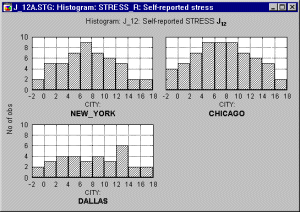
One could conclude that the data suggest that people live in Dallas are less likely to report being stressed, while the patterns (distributions) of stress reporting in New York and Chicago are quite similar.
Categorized graphs in some software systems (e.g., in STATISTICA) also support two-way or multi-way categorizations, where not one criterion (e.g., City) but two or more criteria (e.g., City and Time of the day) are used to create the subsets. Two-way categorized graphs can be thought of as "crosstabulations of graphs" where each component graph represents a cross-section of one level of one grouping variable (e.g., City) and one level of the other grouping variable (e.g., Time).
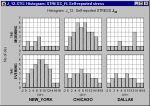
Adding this second factor reveals that the patterns of stress reporting in New York and Chicago are actually quite different when the Time of questioning is taken into consideration, whereas the Time factor makes little difference in Dallas.
Categorized graphs vs. matrix graphs. Matrix graphs also produce displays containing multiple component graphs; however, each of those component graphs are (or can be) based on the same set of cases and the graphs are generated for all combinations of variables from one or two lists. Categorized graphs require a selection of variables that normally would be selected for non-categorized graphs of the respective type (e.g., two variables for a scatterplot). However, in categorized plots, you also need to specify at least one grouping variable (or some criteria to be used for sorting the observations into the categories) that contains information on group membership of each case (e.g., Chicago, Dallas). That grouping variable will not be included in the graph directly (i.e., it will not be plotted) but it will serve as a criterion for dividing all analyzed cases into separate graphs. As illustrated above, one graph will be created for each group (category) identified by the grouping variable.
Common vs. Independent scaling. Each individual category graph may be scaled according to its own range of values (independent scaling),
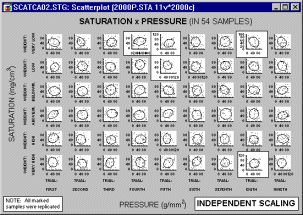
or all graphs may be scaled to a common scale wide enough to accommodate all values in all of the category graphs.
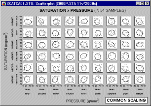
Common scaling allows the analyst to make comparisons of ranges and distributions of values among categories. However, if the ranges of values in graph categories are considerably different (causing a very wide common scale), then some of the graphs may be difficult to examine. The use of independent scaling may make it easier to spot trends and specific patterns within categories, but it may be more difficult to make comparisons of ranges of values among categories.
Categorization Methods
There are five general methods of categorization of values and they will be reviewed briefly in this section: Integer mode, Categories, Boundaries, Codes, and Multiple subsets. Note that the same methods of categorization can be used to categorize cases into component graphs and to categorize cases within component graphs (e.g., in histograms or box plots).
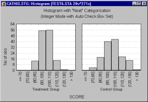
Integer Mode. When you use Integer Mode, integer values of the selected grouping variable will be used to define the categories, and one graph will be created for all cases that belong each category (defined by those integer values). If the selected grouping variable contains non-integer values, the software will usually truncate each encountered value of the selected grouping variable to an integer value.
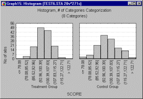
Categories. With this mode of categorization, you will specify the number of categories which you wish to use. The software will divide the entire range of values of the selected grouping variable (from minimum to maximum) into the requested number of equal length intervals.
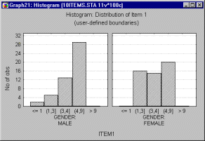
Boundaries. The Boundaries method will also create interval categorization, however, the intervals can be of arbitrary (e.g., uneven) width as defined by custom interval boundaries (for example, "less than �10," "greater than or equal to �10 but less than 0," "greater than or equal to 0 but less than 10," and "equal to or greater than 10").
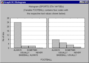
Codes. Use this method if the selected grouping variable contains "codes" (i.e., specific, meaningful values such as Male, Female) from which you want to specify the categories.
Multiple subsets. This method allows you to custom-define the categories and enables you to use more than one variable to define the category. In other words, categorizations based on multiple subset definitions of categories may not represent distributions of specific (individual) variables but distributions of frequencies of specific "events" defined by particular combinations of values of several variables (and defined by conditions which may involve any number of variables from the current data set). For example, you might specify six categories based on combinations of three variables Gender, Age, and Employment.
Histograms
In general, histograms are used to examine frequency distributions of values of variables. For example, the frequency distribution plot shows which specific values or ranges of values of the examined variable are most frequent, how differentiated the values are, whether most observations are concentrated around the mean, whether the distribution is symmetrical or skewed, whether it is multimodal (i.e., has two or more peaks) or unimodal, etc. Histograms are also useful for evaluating the similarity of an observed distribution with theoretical or expected distributions.
Categorized Histograms allow you to produce histograms broken down by one or more categorical variables, or by any other one or more sets of logical categorization rules (see Categorization Methods).
There are two major reasons why frequency distributions are of interest.
Histograms vs. Breakdown. Categorized Histograms provide information similar to breakdowns (e.g., mean, median, minimum, maximum, differentiation of values, etc.; see the Basic Statistics and Tables chapter). Although specific (numerical) descriptive statistics are easier to read in a table, the overall shape and global descriptive characteristics of a distribution are much easier to examine in a graph. Moreover, the graph provides qualitative information about the distribution that cannot be fully represented by any single index. For example, the overall skewed distribution of income may indicate that the majority of people have an income that is much closer to the minimum than maximum of the range of income. Moreover, when broken down by gender and ethnic background, this characteristic of the income distribution may be found to be more pronounced in certain subgroups. Although this information will be contained in the index of skewness (for each sub-group), when presented in the graphical form of a histogram, the information is usually more easily recognized and remembered. The histogram may also reveal "bumps" that may represent important facts about the specific social stratification of the investigated population or anomalies in the distribution of income in a particular group caused by a recent tax reform.
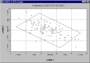
Categorized histograms and scatterplots. A useful application of the categorization methods for continuous variables is to represent the simultaneous relationships between three variables. Shown below is a scatterplot for two variables Load 1 and Load 2.
Now suppose you would like to add a third variable (Output) and examine how it is distributed at different levels of the joint distribution of Load 1 and Load 2. The following graph could be produced:
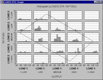
In this graph, Load 1 and Load 2 are both categorized into 5 intervals, and within each combination of intervals the distribution for variable Output is computed. Note that the "box" (parallelogram) encloses approximately the same observations (cases) in both graphs shown above.
Scatterplots
In general, two-dimensional scatterplots are used to visualize relations between two variables X and Y (e.g., weight and height). In scatterplots, individual data points are represented by point markers in two-dimensional space, where axes represent the variables. The two coordinates (X and Y) which determine the location of each point correspond to its specific values on the two variables. If the two variables are strongly related, then the data points form a systematic shape (e.g., a straight line or a clear curve). If the variables are not related, then the points form a round "cloud."
The categorized scatterplot option allows you to produce scatterplots categorized by one or more variables. Via the Multiple Subsets method (see Categorization Methods), you can also categorize the scatterplot based on logical selection conditions that define each category or group of observations.
Categorized scatterplots offer a powerful exploratory and analytic technique for investigating relationships between two or more variables within different sub-groups.
Homogeneity of Bivariate Distributions (Shapes of Relations). Scatterplots are typically used to identify the nature of relations between two variables (e.g., blood pressure and cholesterol level), because they can provide much more information than a correlation coefficient.
For example, a lack of homogeneity in the sample from which a correlation was calculated can bias the value of the correlation. Imagine a case where a correlation coefficient is calculated from data points which came from two different experimental groups, but this fact was ignored when the correlation was calculated. Suppose the experimental manipulation in one of the groups increased the values of both correlated variables, and thus the data from each group form a distinctive "cloud" in the scatterplot (as shown in the following illustration).
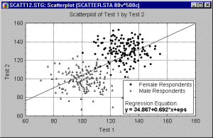
In this example, the high correlation is entirely due to the arrangement of the two groups, and it does not represent the "true" relation between the two variables, which is practically equal to 0 (as could be seen if one looked at each group separately).
If you suspect that such pattern may exist in your data and you know how to identify the possible "subsets" of data, then producing a categorized scatterplot
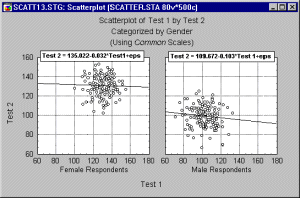
may yield a more accurate picture of the strength of the relationship between the X and Y variable, within each group (i.e., after controlling for group membership).
Curvilinear Relations. Curvilinearity is another aspect of the relationships between variables which can be examined in scatterplots. There are no "automatic" or easy-to-use tests to measure curvilinear relationships between variables: The standard Pearson r coefficient measures only linear relations; some nonparametric correlations such as the Spearman R can measure curvilinear relations, but not non-monotonous relations. Examining scatterplots allows one to identify the shape of relations, so that later an appropriate data transformation can be chosen to "straighten" the data or choose an appropriate nonlinear estimation equation to be fit.
For more information, refer to the chapters on Basic Statistics, Nonparametrics and Distributions, Multiple Regression, and Nonlinear Estimation.
Probability Plots
Three types of categorized probability plots are Normal, Half-Normal, and Detrended. Normal probability plots provide a quick way to visually inspect to what extent the pattern of data follows a normal distribution.
Via categorized probability plots, one can examine how closely the distribution of a variable follows the normal distribution in different sub-groups.
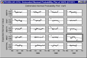
Categorized normal probability plots provide an efficient tool to examine the normality aspect of group homogeneity.
Quantile-Quantile Plots
The categorized Quantile-Quantile (or Q-Q) plot is useful for finding the best fitting distribution within a family of distributions.
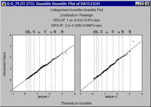
With Categorized Q-Q plots, a series of Quantile-Quantile (or Q-Q) plots, one for each category of cases identified by the X or X and Y category variables (or identified by the Multiple Subset criteria, see Categorization Methods) are produced. Examples of distributions which are used for Q-Q plots are the Exponential Distribution, Extreme Distribution, Normal, Rayleigh, Beta, Gamma, Lognormal, and Weibull distributions.
Probability-Probability Plots
The categorized Probability-Probability (or P-P) plot is useful for determining how well a specific theoretical distribution fits the observed data. This type of graph includes a series of Probability-Probability (or P-P) plots, one for each category of cases identified by the X or X and Y category variables (or identified by the Multiple Subset criteria, see Categorization Methods).
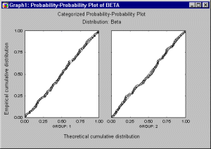
In the P-P plot, the observed cumulative distribution function (the proportion of non-missing values ![]() x) is plotted against a theoretical cumulative distribution function in order to assess the fit of the theoretical distribution to the observed data. If all points in this plot fall onto a diagonal line (with intercept 0 and slope 1), then you can conclude that the theoretical cumulative distribution adequately approximates the observed distribution.
x) is plotted against a theoretical cumulative distribution function in order to assess the fit of the theoretical distribution to the observed data. If all points in this plot fall onto a diagonal line (with intercept 0 and slope 1), then you can conclude that the theoretical cumulative distribution adequately approximates the observed distribution.
If the data points do not all fall on the diagonal line, then you can use this plot to visually assess where the data do and do not follow the distribution (e.g., if the points form an S shape along the diagonal line, then the data may need to be transformed in order to bring them to the desired distribution pattern).
Line Plots
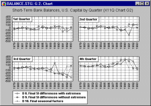
In line plots, individual data points are connected by a line. Line plots provide a simple way to visually present a sequence of many values (e.g., stock market quotes over a number of days). The categorized Line Plots graph is useful when one wants to view such data broken down (categorized) by a grouping variable (e.g., closing stock quotes on Mondays, Tuesdays, etc.) or some other logical criteria involving one or more other variables (e.g., closing quotes only for those days when two other stocks and the Dow Jones index went up, versus all other closing quotes; see Categorization Methods).
Box Plots
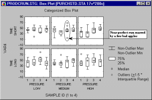
In Box Plots (the term first used by Tukey, 1970), ranges of values of a selected variable (or variables) are plotted separately for groups of cases defined by values of up to three categorical (grouping) variables, or as defined by Multiple Subsets categories.
The central tendency (e.g., median or mean), and range or variation statistics (e.g., quartiles, standard errors, or standard deviations) are computed for each group of cases, and the selected values are presented in one of five styles (Box Whiskers, Whiskers, Boxes, Columns, or High-Low Close). Outlier data points can also be plotted (see the sections on outliers and extremes).
For example, in the following graph, outliers (in this case, points greater or less than 1.5 times the inter-quartile range) indicate a particularly "unfortunate" flaw in an otherwise nearly perfect combination of factors:
However, in the following graph, no outliers or extreme values are evident.
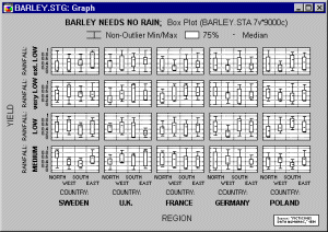
There are two typical applications for box plots: (a) showing ranges of values for individual items, cases or samples (e.g., a typical MIN-MAX plot for stocks or commodities or aggregated sequence data plots with ranges), and (b) showing variation of scores in individual groups or samples (e.g., box and whisker plots presenting the mean for each sample as a point inside the box, standard errors as the box, and standard deviations around the mean as a narrower box or a pair of "whiskers").
Box plots showing variation of scores allow one to quickly evaluate and "intuitively envision" the strength of the relation between the grouping and dependent variable. Specifically, assuming that the dependent variable is normally distributed, and knowing what proportion of observations fall, for example, within �1 or �2 standard deviations from the mean (see Elementary Concepts), one can easily evaluate the results of an experiment and say that, for example, the scores in about 95% of cases in experimental group 1 belong to a different range than scores in about 95% of cases in group 2.
In addition, so-called trimmed means (this term was first used by Tukey, 1962) may be plotted by excluding a user-specified percentage of cases from the extremes (i.e., tails) of the distribution of cases.
Pie Charts
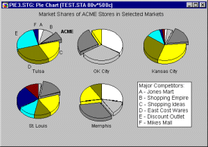
The pie chart is one of the most common graph formats used for representing proportions or values of variables. This graph allows you to produce pie charts broken down by one or more other variables (e.g., grouping variables such as gender) or categorized according to some logical selection conditions that identify Multiple Subsets (see Categorization Methods).
For purposes of this discussion, categorized pie charts will always be interpreted as frequency pie charts (as opposed to data pie charts). This type of pie chart (sometimes called a frequency pie chart) interprets data like a histogram. It categorizes all values of the selected variable following the selected categorization technique and then displays the relative frequencies as pie slices of proportional sizes. Thus, these pie charts offer an alternative method to display frequency histogram data (see the section on Categorized Histograms).
Pie-Scatterplots. Another useful application of categorized pie charts is to represent the relative frequency distribution of a variable at each "location" of the joint distribution of two other variables. Here is an example:
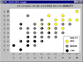
Note that pies are only drawn in "places" where there are data. Thus, the graph shown above takes on the appearance of a scatterplot (of variables L1 and L2), with the individual pies as point markers. However, in addition to the information contained in a simple scatterplot, each pie shows the relative distribution of a third variable at the respective location (i.e., Low, Medium, and High Quality).
Missing/Range Data Points Plots
This graph produces a series of 2D graphs (one for each category of cases identified by the grouping variables or by the Multiple Subset criteria; see Categorization Methods) of missing data points and/or user-specified "out of range" points from which you can visualize the pattern or distribution of missing data (and/or user-specified "out of range" points) within each subset of cases (category).
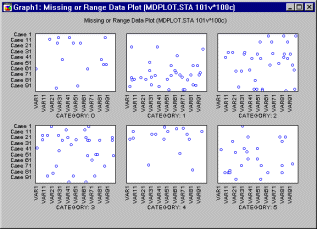
This graph is useful in exploratory data analysis to determine the extent of missing (and/or "out of range") data and whether the patterns of those data occur randomly.
3D Plots
This type of graph allows you to produce 3D scatterplots (space plots, spectral plots, deviation plots, and trace plots), contour plots, and surface plots for subsets of cases defined by the specified categories of a selected variable or categories determined by user-defined case selection conditions (see Categorization Methods). Thus, the general purpose of this plot is to facilitate comparisons between groups or categories regarding the relationships between three or more variables.
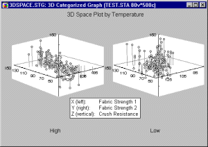
Applications. In general, 3D XYZ graphs summarize the interactive relationships between three variables. The different ways in which data can be categorized (in a Categorized Graph) allow one to review those relationships contingent on some other criterion (e.g., group membership).
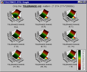
For example, from the categorized surface plot shown below, one can conclude that the setting of the tolerance level in an apparatus does not affect the investigated relationship between the measurements (Depend1, Depend2, and Height) unless the setting is ![]() 3.
3.
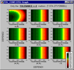
The effect is more salient when you switch to the contour plot representation.
Ternary Plots
A categorized ternary plot can be used to examine relations between three or more dimensions where three of those dimensions represent components of a mixture (i.e., the relations between them is constrained such that the values of the three variables add up to the same constant for each case) for each level of a grouping variable.
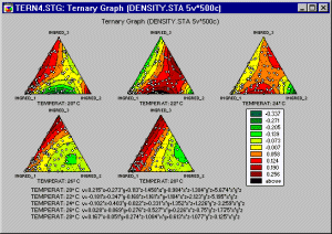
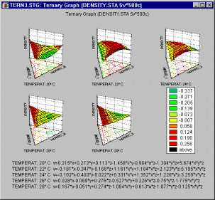
In ternary plots, the triangular coordinate systems are used to plot four (or more) variables (the components X, Y, and Z, and the responses V1, V2, etc.) in two dimensions (ternary scatterplots or contours) or three dimensions (ternary surface plots). In order to produce ternary graphs, the relative proportions of each component within each case are constrained to add up to the same value (e.g., 1).
In a categorized ternary plot, one component graph is produced for each level of the grouping variable (or user-defined subset of data) and all the component graphs are arranged in one display to allow for comparisons between the subsets of data (categories).
Applications. A typical application of this graph is when the measured response(s) from an experiment depends on the relative proportions of three components (e.g., three different chemicals) which are varied in order to determine an optimal combination of those components (e.g., in mixture designs). This type of graph can also be used for other applications where relations between constrained variables need to be compared across categories or subsets of data.
| To index |
Brushing
Perhaps the most common and historically first widely used technique explicitly identified as graphical exploratory data analysis is brushing, an interactive method allowing one to select on-screen specific data points or subsets of data and identify their (e.g., common) characteristics, or to examine their effects on relations between relevant variables (e.g., in scatterplot matrices) or to identify (e.g., label) outliers.
Those relations between variables can be visualized by fitted functions (e.g., 2D lines or 3D surfaces) and their confidence intervals, thus, for example, one can examine changes in those functions by interactively (temporarily) removing or adding specific subsets of data. For example, one of many applications of the brushing technique is to select (i.e., highlight) in a matrix scatterplot all data points that belong to a certain category (e.g., a "medium" income level, see the highlighted subset in the upper right component graph in illustration below):
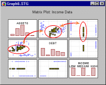
in order to examine how those specific observations contribute to relations between other variables in the same data set (e.g, the correlation between the "debt" and "assets" in the current example).
If the brushing facility supports features like "animated brushing" (see example below) or "automatic function re-fitting," one can define a dynamic brush that would move over the consecutive ranges of a criterion variable (e.g., "income" measured on a continuous scale and not a discrete scale as in the illustration to the above) and examine the dynamics of the contribution of the criterion variable to the relations between other relevant variables in the same data set.
![[Animated Brushing]](graphics/brushing.gif)
| To index |
Smoothing Bivariate Distributions
Three-dimensional histograms are used to visualize crosstabulations of values in two variables. They can be considered to be a conjunction of two simple (i.e., univariate) histograms, combined such that the frequencies of co-occurrences of values on the two analyzed variables can be examined. In a most common format of this graph, a 3D bar is drawn for each "cell" of the crosstabulation table and the height of the bar represents the frequency of values for the respective cell of the table. Different methods of categorization can be used for each of the two variables for which the bivariate distribution is visualized (see below).
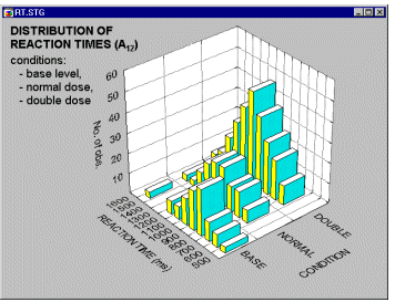
If the software provides smoothing facilities, you can fit surfaces to 3D representations of bivariate frequency data. Thus, every 3D histogram can be turned into a smoothed surface. This technique is of relatively little help if applied to a simple pattern of categorized data (such as the histogram that was shown above).
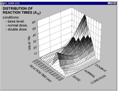
However, if applied to more complex patterns of frequencies, it may provide a valuable exploratory technique,
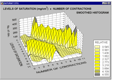
allowing identification of regularities which are less salient when examining the standard 3D histogram representations (e.g., see the systematic surface "wave-patterns" shown on the smoothed histogram above).
| To index |
Layered Compression
When layered compression is used, the main graph plotting area is reduced in size to leave space for Margin Graphs in the upper and right side of the display (and a miniature graph in the corner). These smaller Margin Graphs represent vertically and horizontally compressed images (respectively) of the main graph.
In 2D graphs, layered compression is an exploratory data analysis technique that may facilitate the identification of otherwise obscured trends and patterns in 2-dimensional data sets. For example, in the following illustration
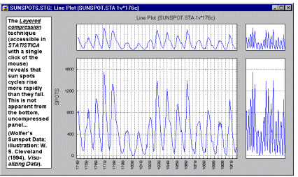
(based on an example discussed by Cleveland, 1993), it can be seen that the number of sunspots in each cycle decays more slowly than it rises at the onset of each cycle. This tendency is not readily apparent when examining the standard line plot; however, the compressed graph uncovers the hidden pattern.
| To index |
Projections of 3D data sets
Contour plots generated by projecting surfaces (created from multivariate, typically three-variable, data sets) offer a useful method to explore and analytically examine the shapes of surfaces.
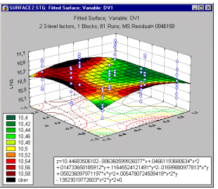
As compared to surface plots, they may be less effective to quickly visualize the overall shape of 3D data structures,
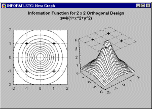
however, their main advantage is that they allow for precise examination and analysis of the shape of the surface
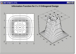
(Contour Plots display a series of undistorted horizontal "cross sections" of the surface).
| To index |
Icon Plots
Icon Graphs represent cases or units of observation as multidimensional symbols and they offer a powerful although not easy to use exploratory technique. The general idea behind this method capitalizes on the human ability to "automatically" spot complex (sometimes interactive) relations between multiple variables if those relations are consistent across a set of instances (in this case "icons"). Sometimes the observation (or a "feeling") that certain instances are "somehow similar" to each other comes before the observer (in this case an analyst) can articulate which specific variables are responsible for the observed conisistency (Lewicki, Hill, & Czyzewska, 1992). However, further analysis that focuses on such intuitively spotted consistencies can reveal the specific nature of the relevant relations between variables.
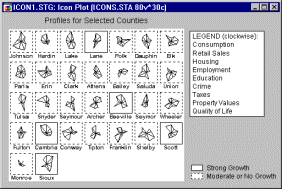
The basic idea of icon plots is to represent individual units of observation as particular graphical objects where values of variables are assigned to specific features or dimensions of the objects (usually one case = one object). The assignment is such that the overall appearance of the object changes as a function of the configuration of values.
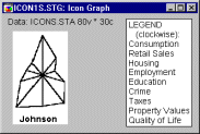
Thus, the objects are given visual "identities" that are unique for configurations of values and that can be identified by the observer. Examining such icons may help to discover specific clusters of both simple relations and interactions between variables.
Analyzing Icon Plots
The "ideal" design of the analysis of icon plots consists of five phases:
Taxonomy of Icon Plots
Most icon plots can be assigned to one of two categories: circular and sequential.
Circular icons. Circular icon plots (star plots, sun ray plots, polygon icons) follow a "spoked wheel" format where values of variables are represented by distances between the center ("hub") of the icon and its edges.
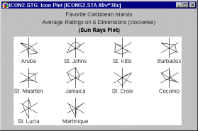
Those icons may help to identify interactive relations between variables because the overall shape of the icon may assume distinctive and identifiable overall patterns depending on multivariate configurations of values of input variables.
In order to translate such "overall patterns" into specific models (in terms of relations between variables) or verify specific observations about the pattern, it is helpful to switch to one of the sequential icon plots which may prove more efficient when one already knows what to look for.
Sequential icons. Sequential icon plots (column icons, profile icons, line icons) follow a simpler format where individual symbols are represented by small sequence plots (of different types).
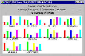
The values of consecutive variables are represented in those plots by distances between the base of the icon and the consecutive break points of the sequence (e.g., the height of the columns shown above). Those plots may be less efficient as a tool for the initial exploratory phase of icon analysis because the icons may look alike. However, as mentioned before, they may be helpful in the phase when some hypothetical pattern has already been revealed and one needs to verify it or articulate it in terms of relations between individual variables.
Pie icons. Pie icon plots fall somewhere in-between the previous two categories; all icons have the same shape (pie) but are sequentially divided in a different way according to the values of consecutive variables.
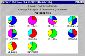
From a functional point of view, they belong rather to the sequential than circular category, although they can be used for both types of applications.
Chernoff faces. This type of icon is a category by itself. Cases are visualized by schematic faces such that relative values of variables selected for the graph are represented by variations of specific facial features.
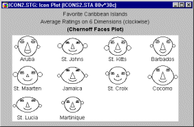
Due to its unique features, it is considered by some researchers as an ultimate exploratory multivariate technique that is capable of revealing hidden patterns of interrelations between variables that cannot be uncovered by any other technique. This statement may be an exaggeration, however. Also, it must be admitted that Chernoff Faces is a method that is difficult to use, and it requires a great deal of experimentation with the assignment of variables to facial features. See also Data Mining Techniques.
Standardization of Values
Except for unusual cases when you intend for the icons to reflect the global differences in ranges of values between the selected variables, the values of the variables should be standardized once to assure within-icon compatibility of value ranges. For example, because the largest value sets the global scaling reference point for the icons, then if there are variables that are in a range of much smaller order, they may not appear in the icon at all, e.g., in a star plot, the rays that represent them will be too short to be visible.
Applications
Icon plots are generally applicable (1) to situations where one wants to find systematic patterns or clusters of observations, and (2) when one wants to explore possible complex relationships between several variables. The first type of application is similar to cluster analysis; that is, it can be used to classify observations.
For example, suppose you studied the personalities of artists, and you recorded the scores for several artists on a number of personality questionnaires. The icon plot may help you determine whether there are natural clusters of artists distinguished by particular patterns of scores on different questionnaires (e.g., you may find that some artists are very creative, undisciplined, and independent, while a second group is particularly intelligent, disciplined, and concerned with publicly-acknowledged success).
The second type of application -- the exploration of relationships between several variables -- is more similar to factor analysis; that is, it can be used to detect which variables tend to "go together." For example, suppose you were studying the structure of people�s perception of cars. Several subjects completed detailed questionnaires rating different cars on numerous dimensions. In the data file, the average ratings on each dimension (entered as the variables) for each car (entered as cases or observations) are recorded.
When you now study the Chernoff faces (each face representing the perceptions for one car), it may occur to you that smiling faces tend to have big ears; if price was assigned to the amount of smile and acceleration to the size of ears, then this "discovery" means that fast cars are more expensive. This, of course, is only a simple example; in real-life exploratory data analyses, non-obvious complex relationships between variables may become apparent.
Related Graphs
Matrix plots visualize relations between variables from one or two lists. If the software allows you to mark selected subsets, matrix plots may provide information similar to that in icon plots.
If the software allows you to create and identify user-defined subsets in scatterplots, simple 2D scatterplots can be used to explore the relationships between two variables; likewise, when exploring the relationships between three variables, 3D scatterplots provide an alternative to icon plots.
Graph Type
There are various types of Icon Plots.
Chernoff Faces. A separate "face" icon is drawn for each case; relative values of the selected variables for each case are assigned to shapes and sizes of individual facial features (e.g., length of nose, angle of eyebrows, width of face).
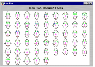
For more information see Chernoff Faces in Taxonomy of Icon Plots.
Stars. Star Icons is a circular type of icon plot. A separate star-like icon is plotted for each case; relative values of the selected variables for each case are represented (clockwise, starting at 12:00) by the length of individual rays in each star. The ends of the rays are connected by a line.
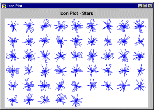
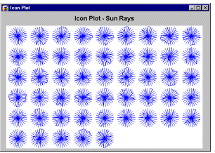
Sun Rays. Sun Ray Icons is a circular type of icon plot. A separate sun-like icon is plotted for each case; each ray represents one of the selected variables (clockwise, starting at 12:00), and the length of the ray represents the relative value of the respective variable. Data values of the variables for each case are connected by a line.
Polygons. Polygon Icons is a circular type of icon plot. A separate polygon icon is plotted for each case; relative values of the selected variables for each case are represented by the distance from the center of the icon to consecutive corners of the polygon (clockwise, starting at 12:00).

Pies. Pie Icons is a circular type of icon plot. Data values for each case are plotted as a pie chart (clockwise, starting at 12:00); relative values of selected variables are represented by the size of the pie slices.

Columns. Column Icons is a sequential type of icon plot. An individual column graph is plotted for each case; relative values of the selected variables for each case are represented by the height of consecutive columns.

Lines. Line Icons is a sequential type of icon plot.
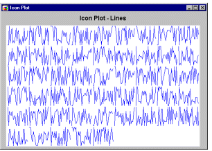
An individual line graph is plotted for each case; relative values of the selected variables for each case are represented by the height of consecutive break points of the line above the baseline.
Profiles. Profile Icons is a sequential type of icon plot. An individual area graph is plotted for each case; relative values of the selected variables for each case are represented by the height of consecutive peaks of the profile above the baseline.
Mark Icons
If the software allows you to specify multiple subsets, it is useful to specify the cases (subjects) whose icons will be marked (i.e., frames will be placed around the selected icons) in the plot.
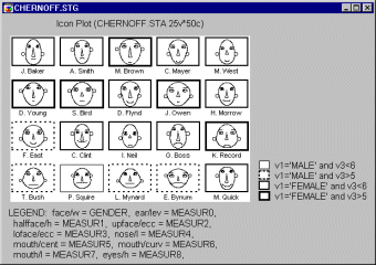
The line patterns of frames which identify specific subsets should be listed in the legend along with the case selection conditions. The following graph shows an example of marked subsets.
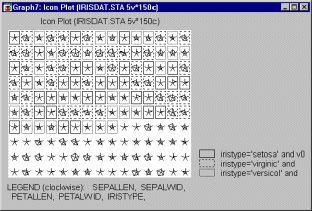
All cases (observations) which meet the condition specified in Subset 1 (i.e., cases for which the value of variable Iristype is equal to Setosa and for which the case number is less than 100) are marked with a specific frame around the selected icons.
All cases which meet the condition outlined in Subset 2 (i.e., cases for which the value of Iristype is equal to Virginic and for which the case number is less than 100) are assigned a different frame around the selected icons.
| To index |
Data Reduction
Sometimes plotting an extremely large data set, can obscure an existing pattern (see the animation below). When you have a very large data file, it can be useful to plot only a subset of the data, so that the pattern is not hidden by the number of point markers.
![[Data Reduction Animation]](graphics/an_reduc.gif)
Some software products offer methods for data reduction (or optimizing) which can be useful in these instances. Ideally, a data reduction option will allow you to specify an integer value n less than the number of cases in the data file. Then the software will randomly select approximately n cases from the available cases and create the plot based on these cases only.
Note that such data set (or sample size) reduction methods effectively draw a random sample from the current data set. Obviously, the nature of such data reduction is entirely different than when data are selectively reduced only to a specific subset or split into subgroups based on certain criteria (e.g., such as gender, region, or cholesterol level). The latter methods can be implemented interactively (e.g., using animated brushing facilities), or other techniques (e.g., categorized graphs or case selection conditions). All these methods can further aid in identifying patterns in large data sets.
| To index |
Data Rotation (in 3D space)
Changing the viewpoint for 3D scatterplots (e.g., simple, spectral, or space plots) may prove to be an effective exploratory technique since it can reveal patterns that are easily obscured unless you look at the "cloud" of data points from an appropriate angle (see the animation below).
![[Data Rotation Animation]](graphics/an_rotate.gif)
Some software products offer interactive perspective, rotation, and continuous spinning controls which can be useful in these instances. Ideally, these controls will allow you to adjust the graph's angle and perspective to find the most informative location of the "viewpoint" for the graph as well as allowing you to control the vertical and horizontal rotation of the graph.
While these facilities are useful for initial exploratory data analysis, they can also be quite beneficial in exploring the factorial space (see Factor Analysis) and exploring the dimensional space (see Multidimensional Scaling).
| To index |