Trade policy analysis 3: export subsidies
Example: The U.S. market for wheat (Q=billion bushels)
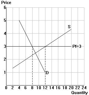
A. Free trade: The diagram above illustrates the U.S. free-trade
situation.
B. Export subsidy (Xsub): the U.S. implements a $1 per bushel
subsidy on wheat exports.
Step 1: In
the diagram, shift Pf up by the amount of the export subsidy (label
your new curve Pf+Xsub)
Step 2: Label
the new domestic price and quantities with the export subsidy.
Step 3: Complete
Table 1.
| Table 1 |
| Situation in the U.S.: |
Free trade |
Export subsidy |
| Price |
|
|
| Quantity produced |
|
|
| Quantity consumed |
|
|
| Quantity exported |
|
|
C. Analysis: Comparing the export subsidy to free trade.
Step 1: In
the diagram, indicate the change in consumer surplus (\\\), producer surplus
(///), and the change in government revenue (|||).
Step 2: Complete
Table 2.
| Table 2: export subsidy versus
free trade |
| |
Area in graph |
Amount |
| Change in consumer surplus |
|
|
| Change in producer surplus |
|
|
| Change in government revneue |
|
|
| Change in national welfare |
|
|