MEASURING WASTE FROM INEFFICIENCY
We know from Chapters 5 and 6 that consumer surplus and producer surplus are measures of how much consumers and producers gain from buying and selling in a market. The larger these two surpluses are, the better off people are in the society. The amount of consumer surplus plus producer surplus is a measure of economic well-being.
Maximizing the Sum of Producer Plus Consumer Surplus
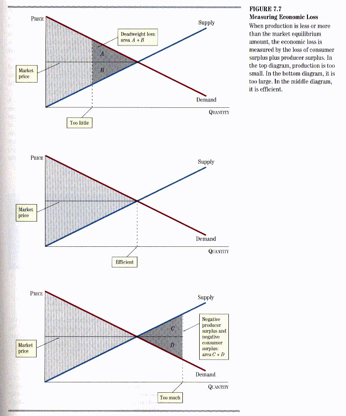
An attractive feature of competitive markets is that they maximize the sum of consumer and producer surplus. Producer and consumer surplus are shown with the market supply and market demand diagram in Figure 7.7. Recall that the producer surplus for all producers is the area above the supply curve and below the market price line. The consumer surplus for all consumers is the area below the demand curve and above the market price line. Both the consumer surplus and the producer surplus are shown in Figure 7.7. The equilibrium quantity is at the intersection of the two curves. At this point consumer surplus plus producer surplus is maximized.
Deadweight Loss
Figure 7.7 also shows what happens to consumer surplus plus producer surplus when the efficient level of production does not occur. The top panel of Figure 7.7 shows a situation where production is lower than the market equilibrium quantity, and clearly the sum of consumer and producer surplus is lower. By producing a smaller amount, we lose some of the consumer and producer surplus in the darkly shaded triangular area A + B. The bottom panel of Figure 7.7 shows the opposite situation, where production is too high. In this case, we have to subtract out the triangular area C + D from the lightly shaded area on the left because price is greater than marginal benefit and lower than marginal cost, which means that consumer surplus and producer surplus are negative in the area C + D. In both the top and bottom panels of the figure, these darkly shaded triangles are a loss to society from producing more or less than the efficient amount. Economists call this loss the deadweight loss. It is a measure of the waste from inefficient production.
Deadweight loss is not simply a theoretical curiosity with a gruesome name; it is used by economists to measure the size of the waste to society of deviations from the competitive equilibrium. By calculating deadweight loss, economists can estimate the benefits and costs of many government programs. When you hear or read that the cost of U.S. agricultural programs is billions of dollars or that the benefit of a world-trade agreement is trillions of dollars, it is the increase or decrease in deadweight loss that is being referred to. (See the box on the opposite page.) In order to compute the deadweight loss all we need is the demand curve and the supply curve.
Using Economics to Explain the Cost of Federal Farm Programs
For many years, the U.S. government has supported U.S. agriculture by instituting a minimum price for sugar, wool, wheat, peanuts, honey, and other farm products. These price floors raise the price of these products to U.S. consumers. The figure in panel A shows how a minimum price causes a surplus of any one of these products due to the combination of increased quantity supplied and lower quantity demanded at the higher price. The government would have to buy this surplus to keep the price high--at a large cost to the taxpayer.
However, in order to reduce the taxpayers' cost, in most cases the government attempts to reduce the surplus by limiting the cultivated acreage. For example, the U.S. government has used set-aside or acreage allotment programs in which farmers agree to limit the acres they plant in order to qualify for price supports. This reduces the surplus and the government does not have to pay farmers as much for their production.
The effect of set-asides is shown in panel B. The limit on the amount that can be produced is shown by the solid vertical line. The govern-ment limits production to the amount Q1. This limit leads to a market price P1 equal to the support price but higher than the free market price without supports. In fact, the U.S. government calculates Q1 by estimating the demand curve and finding the quantity demanded by consumers at the support price P1. But these programs are still very costly because people consume fewer farm products at a higher price. There is a deadweight loss, as shown in panel B.
Compared to the free market, consumers lose much more than the deadweight
loss. They also lose the blue rectangular area in panel
B. However, that loss in consumer surplus is a gain in producer surplus
and is not a net loss to society. But if the typical farmer is richer than
the typical consumer, then this transfer makes the income distribution
more unequal. (Note how the term surplus is used differently from
consumer surplus or producer surplus.)