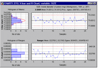
In all production processes, we need to monitor the extent to which our products meet specifications. In the most general terms, there are two "enemies" of product quality: (1) deviations from target specifications, and (2) excessive variability around target specifications. During the earlier stages of developing the production process, designed experiments are often used to optimize these two quality characteristics (see Experimental Design); the methods provided in Quality Control are on-line or in-process quality control procedures to monitor an on-going production process. For detailed descriptions of these charts and extensive annotated examples, see Buffa (1972), Duncan (1974) Grant and Leavenworth (1980), Juran (1962), Juran and Gryna (1970), Montgomery (1985, 1991), Shirland (1993), or Vaughn (1974). Two recent excellent introductory texts with a "how-to" approach are Hart & Hart (1989) and Pyzdek (1989); two recent German language texts on this subject are Rinne and Mittag (1995) and Mittag (1993).
| To index |
General Approach
The general approach to on-line quality control is straightforward: We simply extract samples of a certain size from the ongoing production process. We then produce line charts of the variability in those samples, and consider their closeness to target specifications. If a trend emerges in those lines, or if samples fall outside pre-specified limits, then we declare the process to be out of control and take action to find the cause of the problem. These types of charts are sometimes also referred to as Shewhart control charts (named after W. A. Shewhart who is generally credited as being the first to introduce these methods; see Shewhart, 1931).
Interpreting the chart. The most standard display actually contains two charts (and two histograms); one is called an X-bar chart, the other is called an R chart.

In both line charts, the horizontal axis represents the different samples; the vertical axis for the X-bar chart represents the means for the characteristic of interest; the vertical axis for the R chart represents the ranges. For example, suppose we wanted to control the diameter of piston rings that we are producing. The center line in the X-bar chart would represent the desired standard size (e.g., diameter in millimeters) of the rings, while the center line in the R chart would represent the acceptable (within-specification) range of the rings within samples; thus, this latter chart is a chart of the variability of the process (the larger the variability, the larger the range). In addition to the center line, a typical chart includes two additional horizontal lines to represent the upper and lower control limits (UCL, LCL, respectively); we will return to those lines shortly. Typically, the individual points in the chart, representing the samples, are connected by a line. If this line moves outside the upper or lower control limits or exhibits systematic patterns across consecutive samples (see Runs Tests), then a quality problem may potentially exist.
| To index |
Establishing Control Limits
Even though one could arbitrarily determine when to declare a process out of control (that is, outside the UCL-LCL range), it is common practice to apply statistical principles to do so. Elementary Concepts discusses the concept of the sampling distribution, and the characteristics of the normal distribution. The method for constructing the upper and lower control limits is a straightforward application of the principles described there.
Example. Suppose we want to control the mean of a variable, such as the size of piston rings. Under the assumption that the mean (and variance) of the process does not change, the successive sample means will be distributed normally around the actual mean. Moreover, without going into details regarding the derivation of this formula, we also know (because of the central limit theorem, and thus approximate normal distribution of the means; see, for example, Hoyer and Ellis, 1996) that the distribution of sample means will have a standard deviation of Sigma (the standard deviation of individual data points or measurements) over the square root of n (the sample size). It follows that approximately 95% of the sample means will fall within the limits ![]() � 1.96 * Sigma/Square Root(n) (refer to Elementary Concepts for a discussion of the characteristics of the normal distribution and the central limit theorem). In practice, it is common to replace the 1.96 with 3 (so that the interval will include approximately 99% of the sample means), and to define the upper and lower control limits as plus and minus 3 sigma limits, respectively.
� 1.96 * Sigma/Square Root(n) (refer to Elementary Concepts for a discussion of the characteristics of the normal distribution and the central limit theorem). In practice, it is common to replace the 1.96 with 3 (so that the interval will include approximately 99% of the sample means), and to define the upper and lower control limits as plus and minus 3 sigma limits, respectively.
General case. The general principle for establishing control limits just described applies to all control charts. After deciding on the characteristic we want to control, for example, the standard deviation, we estimate the expected variability of the respective characteristic in samples of the size we are about to take. Those estimates are then used to establish the control limits on the chart.
| To index |
Common Types of Charts
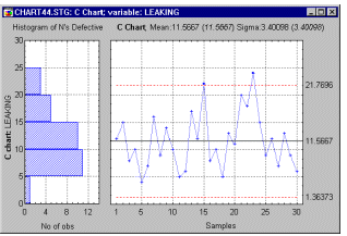
The types of charts are often classified according to the type of quality characteristic that they are supposed to monitor: there are quality control charts for variables and control charts for attributes. Specifically, the following charts are commonly constructed for controlling variables:
| To index |
Short Run Charts
The short run control chart, or control chart for short production runs, plots observations of variables or attributes for multiple parts on the same chart. Short run control charts were developed to address the requirement that several dozen measurements of a process must be collected before control limits are calculated. Meeting this requirement is often difficult for operations that produce a limited number of a particular part during a production run.
For example, a paper mill may produce only three or four (huge) rolls of a particular kind of paper (i.e., part) and then shift production to another kind of paper. But if variables, such as paper thickness, or attributes, such as blemishes, are monitored for several dozen rolls of paper of, say, a dozen different kinds, control limits for thickness and blemishes could be calculated for the transformed (within the short production run) variable values of interest. Specifically, these transformations will rescale the variable values of interest such that they are of compatible magnitudes across the different short production runs (or parts). The control limits computed for those transformed values could then be applied in monitoring thickness, and blemishes, regardless of the types of paper (parts) being produced. Statistical process control procedures could be used to determine if the production process is in control, to monitor continuing production, and to establish procedures for continuous quality improvement.
For additional discussions of short run charts refer to Bothe (1988), Johnson (1987), or Montgomery (1991).
Short Run Charts for Variables
Nominal chart, target chart. There are several different types of short run charts. The most basic are the nominal short run chart, and the target short run chart. In these charts, the measurements for each part are transformed by subtracting a part-specific constant. These constants can either be the nominal values for the respective parts (nominal short run chart), or they can be target values computed from the (historical) means for each part (Target X-bar and R chart). For example, the diameters of piston bores for different engine blocks produced in a factory can only be meaningfully compared (for determining the consistency of bore sizes) if the mean differences between bore diameters for different sized engines are first removed. The nominal or target short run chart makes such comparisons possible. Note that for the nominal or target chart it is assumed that the variability across parts is identical, so that control limits based on a common estimate of the process sigma are applicable.
Standardized short run chart. If the variability of the process for different parts cannot be assumed to be identical, then a further transformation is necessary before the sample means for different parts can be plotted in the same chart. Specifically, in the standardized short run chart the plot points are further transformed by dividing the deviations of sample means from part means (or nominal or target values for parts) by part-specific constants that are proportional to the variability for the respective parts. For example, for the short run X-bar and R chart, the plot points (that are shown in the X-bar chart) are computed by first subtracting from each sample mean a part specific constant (e.g., the respective part mean, or nominal value for the respective part), and then dividing the difference by another constant, for example, by the average range for the respective chart. These transformations will result in comparable scales for the sample means for different parts.
Short Run Charts for Attributes
For attribute control charts (C, U, Np, or P charts), the estimate of the variability of the process (proportion, rate, etc.) is a function of the process average (average proportion, rate, etc.; for example, the standard deviation of a proportion p is equal to the square root of p*(1- p)/n). Hence, only standardized short run charts are available for attributes. For example, in the short run P chart, the plot points are computed by first subtracting from the respective sample p values the average part p's, and then dividing by the standard deviation of the average p's.
| To index |
Multiple Stream Group Charts
The group control chart plots multiple streams of observations or attributes on the same chart. This simplifies interpretation when monitoring many process streams or characteristics. Process streams may be different machines, assembly lines, operators, or the like. All of these may be plotted on a single group chart.
For a group X-bar chart, two points are plotted for each of the samples for which measurements are collected, producing two plotted lines across samples. The upper line is a plot of the highest mean values from the multiple streams or attributes measured for each of the samples, and the lower line is a plot of the lowest mean values from the multiple streams or attributes for each of the samples. These upper and lower plotted points represent the maximum and minimum mean values across the multiple streams or attributes for each sample, and if these extreme values are within the specified control limits, then obviously all other mean values are also within the control limits. The group X-bar chart, therefore, allows one to quickly determine whether many process streams or characteristics are under control without necessarily inspecting each and every measurement.
For group R-bar, S, or S**2 charts for variables, or for group C, U, Np, or P charts for attributes, the two points that are plotted for each sample are the respective maximum and minimum ranges, standard deviations, etc., from the multiple streams or attributes measured for each sample. As with the group X-bar chart, comparison of these extreme values with the specified control limits allows one to quickly determine whether the multiple process streams or characteristics are under control.
A group chart for a single part is referred to as a standard group chart, or simply a group chart, as it is commonly called. Group charts for multiple parts are referred to as group short run charts. The same procedure is used for producing group short run charts as for producing standard group charts; the only difference for group short run charts is that the plot points are determined after all short run transformations of the data within parts have been performed.
| To index |
Unequal Sample Sizes
When the samples plotted in the control chart are not of equal size, then the control limits around the center line (target specification) cannot be represented by a straight line. For example, to return to the formula Sigma/Square Root(n) presented earlier for computing control limits for the X-bar chart, it is obvious that unequal n's will lead to different control limits for different sample sizes. There are three ways of dealing with this situation.
Average sample size. If one wants to maintain the straight-line control limits (e.g., to make the chart easier to read and easier to use in presentations), then one can compute the average n per sample across all samples, and establish the control limits based on the average sample size. This procedure is not "exact," however, as long as the sample sizes are reasonably similar to each other, this procedure is quite adequate.
Variable control limits. Alternatively, one may compute different control limits for each sample, based on the respective sample sizes. This procedure will lead to variable control limits, and result in step-chart like control lines in the plot. This procedure ensures that the correct control limits are computed for each sample. However, one loses the simplicity of straight-line control limits.
Stabilized (normalized) chart. The best of two worlds (straight line control limits that are accurate) can be accomplished by standardizing the quantity to be controlled (mean, proportion, etc.) according to units of sigma. The control limits can then be expressed in straight lines, while the location of the sample points in the plot depend not only on the characteristic to be controlled, but also on the respective sample n's. The disadvantage of this procedure is that the values on the vertical (Y) axis in the control chart are in terms of sigma rather than the original units of measurement, and therefore, those numbers cannot be taken at face value (e.g., a sample with a value of 3 is 3 times sigma away from specifications; in order to express the value of this sample in terms of the original units of measurement, we need to perform some computations to convert this number back).
| To index |
Control Charts for Variables vs. Charts for Attributes
Sometimes, the quality control engineer has a choice between variable control charts and attribute control charts.
Advantages of attribute control charts. Attribute control charts have the advantage of allowing for quick summaries of various aspects of the quality of a product, that is, the engineer may simply classify products as acceptable or unacceptable, based on various quality criteria. Thus, attribute charts sometimes bypass the need for expensive, precise devices and time-consuming measurement procedures. Also, this type of chart tends to be more easily understood by managers unfamiliar with quality control procedures; therefore, it may provide more persuasive (to management) evidence of quality problems.
Advantages of variable control charts. Variable control charts are more sensitive than attribute control charts (see Montgomery, 1985, p. 203). Therefore, variable control charts may alert us to quality problems before any actual "unacceptables" (as detected by the attribute chart) will occur. Montgomery (1985) calls the variable control charts leading indicators of trouble that will sound an alarm before the number of rejects (scrap) increases in the production process.
Control Chart for Individual Observations
Variable control charts can by constructed for individual observations taken from the production line, rather than samples of observations. This is sometimes necessary when testing samples of multiple observations would be too expensive, inconvenient, or impossible. For example, the number of customer complaints or product returns may only be available on a monthly basis; yet, one would like to chart those numbers to detect quality problems. Another common application of these charts occurs in cases when automated testing devices inspect every single unit that is produced. In that case, one is often primarily interested in detecting small shifts in the product quality (for example, gradual deterioration of quality due to machine wear). The CUSUM, MA, and EWMA charts of cumulative sums and weighted averages discussed below may be most applicable in those situations.
| To index |
Out-Of-Control Process: Runs Tests
As mentioned earlier in the introduction, when a sample point (e.g., mean in an X-bar chart) falls outside the control lines, one has reason to believe that the process may no longer be in control. In addition, one should look for systematic patterns of points (e.g., means) across samples, because such patterns may indicate that the process average has shifted. These tests are also sometimes referred to as AT&T runs rules (see AT&T, 1959) or tests for special causes (e.g., see Nelson, 1984, 1985; Grant and Leavenworth, 1980; Shirland, 1993). The term special or assignable causes as opposed to chance or common causes was used by Shewhart to distinguish between a process that is in control, with variation due to random (chance) causes only, from a process that is out of control, with variation that is due to some non-chance or special (assignable) factors (cf. Montgomery, 1991, p. 102).
As the sigma control limits discussed earlier, the runs rules are based on "statistical" reasoning. For example, the probability of any sample mean in an X-bar control chart falling above the center line is equal to 0.5, provided (1) that the process is in control (i.e., that the center line value is equal to the population mean), (2) that consecutive sample means are independent (i.e., not auto-correlated), and (3) that the distribution of means follows the normal distribution. Simply stated, under those conditions there is a 50-50 chance that a mean will fall above or below the center line. Thus, the probability that two consecutive means will fall above the center line is equal to 0.5 times 0.5 = 0.25.
Accordingly, the probability that 9 consecutive samples (or a run of 9 samples) will fall on the same side of the center line is equal to 0.5**9 = .00195. Note that this is approximately the probability with which a sample mean can be expected to fall outside the 3- times sigma limits (given the normal distribution, and a process in control). Therefore, one could look for 9 consecutive sample means on the same side of the center line as another indication of an out-of-control condition. Refer to Duncan (1974) for details concerning the "statistical" interpretation of the other (more complex) tests.
Zone A, B, C. Customarily, to define the runs tests, the area above and below the chart center line is divided into three "zones."
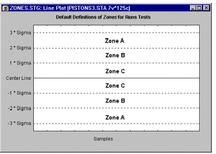
By default, Zone A is defined as the area between 2 and 3 times sigma above and below the center line; Zone B is defined as the area between 1 and 2 times sigma, and Zone C is defined as the area between the center line and 1 times sigma.
9 points in Zone C or beyond (on one side of central line). If this test is positive (i.e., if this pattern is detected), then the process average has probably changed. Note that it is assumed that the distribution of the respective quality characteristic in the plot is symmetrical around the mean. This is, for example, not the case for R charts, S charts, or most attribute charts. However, this is still a useful test to alert the quality control engineer to potential shifts in the process. For example, successive samples with less-than-average variability may be worth investigating, since they may provide hints on how to decrease the variation in the process.
6 points in a row steadily increasing or decreasing. This test signals a drift in the process average. Often, such drift can be the result of tool wear, deteriorating maintenance, improvement in skill, etc. (Nelson, 1985).
14 points in a row alternating up and down. If this test is positive, it indicates that two systematically alternating causes are producing different results. For example, one may be using two alternating suppliers, or monitor the quality for two different (alternating) shifts.
2 out of 3 points in a row in Zone A or beyond. This test provides an "early warning" of a process shift. Note that the probability of a false-positive (test is positive but process is in control) for this test in X-bar charts is approximately 2%.
4 out of 5 points in a row in Zone B or beyond. Like the previous test, this test may be considered to be an "early warning indicator" of a potential process shift. The false- positive error rate for this test is also about 2%.
15 points in a row in Zone C (above and below the center line). This test indicates a smaller variability than is expected (based on the current control limits).
8 points in a row in Zone B, A, or beyond, on either side of the center line (without points in Zone C). This test indicates that different samples are affected by different factors, resulting in a bimodal distribution of means. This may happen, for example, if different samples in an X-bar chart where produced by one of two different machines, where one produces above average parts, and the other below average parts.
| To index |
Operating Characteristic (OC) Curves
A common supplementary plot to standard quality control charts is the so-called operating characteristic or OC curve (see example below). One question that comes to mind when using standard variable or attribute charts is how sensitive is the current quality control procedure? Put in more specific terms, how likely is it that you will not find a sample (e.g., mean in an X-bar chart) outside the control limits (i.e., accept the production process as "in control"), when, in fact, it has shifted by a certain amount? This probability is usually referred to as the ![]() (beta) error probability, that is, the probability of erroneously accepting a process (mean, mean proportion, mean rate defectives, etc.) as being "in control." Note that operating characteristic curves pertain to the false-acceptance probability using the sample-outside-of- control-limits criterion only, and not the runs tests described earlier.
(beta) error probability, that is, the probability of erroneously accepting a process (mean, mean proportion, mean rate defectives, etc.) as being "in control." Note that operating characteristic curves pertain to the false-acceptance probability using the sample-outside-of- control-limits criterion only, and not the runs tests described earlier.
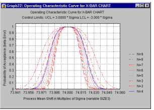
Operating characteristic curves are extremely useful for exploring the power of our quality control procedure. The actual decision concerning sample sizes should depend not only on the cost of implementing the plan (e.g., cost per item sampled), but also on the costs resulting from not detecting quality problems. The OC curve allows the engineer to estimate the probabilities of not detecting shifts of certain sizes in the production quality.
Process Capability Indices
For variable control charts, it is often desired to include so-called process capability indices in the summary graph. In short, process capability indices express (as a ratio) the proportion of parts or items produced by the current process that fall within user-specified limits (e.g., engineering tolerances).
For example, the so-called Cp index is computed as:
Cp = (USL-LSL)/(6*sigma)
where sigma is the estimated process standard deviation, and USL and LSL are the upper and lower specification (engineering) limits, respectively. If the distribution of the respective quality characteristic or variable (e.g., size of piston rings) is normal, and the process is perfectly centered (i.e., the mean is equal to the design center), then this index can be interpreted as the proportion of the range of the standard normal curve (the process width) that falls within the engineering specification limits. If the process is not centered, an adjusted index Cpk is used instead. For a "capable" process, the Cp index should be greater than 1, that is, the specification limits would be larger than 6 times the sigma limits, so that over 99% of all items or parts produced could be expected to fall inside the acceptable engineering specifications. For a detailed discussion of this and other indices, refer to Process Analysis.
| To index |
Other Specialized Control Charts
The types of control charts mentioned so far are the "workhorses" of quality control, and they are probably the most widely used methods. However, with the advent of inexpensive desktop computing, procedures requiring more computational effort have become increasingly popular.
X-bar Charts For Non-Normal Data. The control limits for standard X-bar charts are constructed based on the assumption that the sample means are approximately normally distributed. Thus, the underlying individual observations do not have to be normally distributed, since, as the sample size increases, the distribution of the means will become approximately normal (i.e., see discussion of the central limit theorem in the Elementary Concepts
; however, note that for R, S� and S**2 charts, it is assumed that the individual observations are normally distributed). Shewhart (1931) in his original work experimented with various non-normal distributions for individual observations, and evaluated the resulting distributions of means for samples of size four. He concluded that, indeed, the standard normal distribution-based control limits for the means are appropriate, as long as the underlying distribution of observations are approximately normal. (See also Hoyer and Ellis, 1996, for an introduction and discussion of the distributional assumptions for quality control charting.)However, as Ryan (1989) points out, when the distribution of observations is highly skewed and the sample sizes are small, then the resulting standard control limits may produce a large number of false alarms (increased alpha error rate), as well as a larger number of false negative ("process-is-in-control") readings (increased beta-error rate). You can compute control limits (as well as process capability indices) for X-bar charts based on so-called Johnson curves(Johnson, 1949), which allow to approximate the skewness and kurtosis for a large range of non-normal distributions (see also Fitting Distributions by Moments, in Process Analysis). These non- normal X-bar charts are useful when the distribution of means across the samples is clearly skewed, or otherwise non-normal.
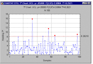
Hotelling T**2 Chart. When there are multiple related quality characteristics (recorded in several variables), we can produce a simultaneous plot (see example below) for all means based on Hotelling multivariate T**2 statistic (first proposed by Hotelling, 1947).
Cumulative Sum (CUSUM) Chart. The CUSUM chart was first introduced by Page (1954); the mathematical principles involved in its construction are discussed in Ewan (1963), Johnson (1961), and Johnson and Leone (1962).
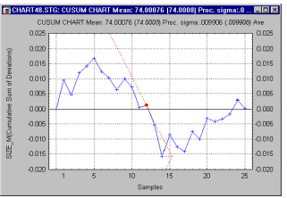
If one plots the cumulative sum of deviations of successive sample means from a target specification, even minor, permanent shifts in the process mean will eventually lead to a sizable cumulative sum of deviations. Thus, this chart is particularly well-suited for detecting such small permanent shifts that may go undetected when using the X-bar chart. For example, if, due to machine wear, a process slowly "slides" out of control to produce results above target specifications, this plot would show a steadily increasing (or decreasing) cumulative sum of deviations from specification.
To establish control limits in such plots, Barnhard (1959) proposed the so-called V- mask, which is plotted after the last sample (on the right). The V-mask can be thought of as the upper and lower control limits for the cumulative sums. However, rather than being parallel to the center line; these lines converge at a particular angle to the right, producing the appearance of a V rotated on its side. If the line representing the cumulative sum crosses either one of the two lines, the process is out of control.
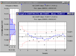
Moving Average (MA) Chart. To return to the piston ring example, suppose we are mostly interested in detecting small trends across successive sample means. For example, we may be particularly concerned about machine wear, leading to a slow but constant deterioration of quality (i.e., deviation from specification). The CUSUM chart described above is one way to monitor such trends, and to detect small permanent shifts in the process average. Another way is to use some weighting scheme that summarizes the means of several successive samples; moving such a weighted mean across the samples will produce a moving average chart (as shown in the following graph).
Exponentially-weighted Moving Average (EWMA) Chart. The idea of moving averages of successive (adjacent) samples can be generalized. In principle, in order to detect a trend we need to weight successive samples to form a moving average; however, instead of a simple arithmetic moving average, we could compute a geometric moving average (this chart (see graph below) is also called Geometric Moving Average chart, see Montgomery, 1985, 1991).
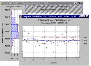
Specifically, we could compute each data point for the plot as:
zt = ![]() *x-bart + (1-
*x-bart + (1-![]() )*zt-1
)*zt-1
In this formula, each point zt is computed as ![]() (lambda) times the respective mean x-bart, plus one minus
(lambda) times the respective mean x-bart, plus one minus ![]() times the previous (computed) point in the plot. The parameter
times the previous (computed) point in the plot. The parameter ![]() (lambda) here should assume values greater than 0 and less than 1. Without going into detail (see Montgomery, 1985, p. 239), this method of averaging specifies that the weight of historically "old" sample means decreases geometrically as one continues to draw samples. The interpretation of this chart is much like that of the moving average chart, and it allows us to detect small shifts in the means, and, therefore, in the quality of the production process.
(lambda) here should assume values greater than 0 and less than 1. Without going into detail (see Montgomery, 1985, p. 239), this method of averaging specifies that the weight of historically "old" sample means decreases geometrically as one continues to draw samples. The interpretation of this chart is much like that of the moving average chart, and it allows us to detect small shifts in the means, and, therefore, in the quality of the production process.
Regression Control Charts. Sometimes we want to monitor the relationship between two aspects of our production process. For example, a post office may want to monitor the number of worker-hours that are spent to process a certain amount of mail. These two variables should roughly be linearly correlated with each other, and the relationship can probably be described in terms of the well-known Pearson product-moment correlation coefficient r. This statistic is also described in Basic Statistics. The regression control chart contains a regression line that summarizes the linear relationship between the two variables of interest. The individual data points are also shown in the same graph. Around the regression line we establish a confidence interval within which we would expect a certain proportion (e.g., 95%) of samples to fall. Outliers in this plot may indicate samples where, for some reason, the common relationship between the two variables of interest does not hold.
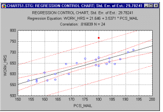
Applications. There are many useful applications for the regression control chart. For example, professional auditors may use this chart to identify retail outlets with a greater than expected number of cash transactions given the overall volume of sales, or grocery stores with a greater than expected number of coupons redeemed, given the total sales. In both instances, outliers in the regression control charts (e.g., too many cash transactions; too many coupons redeemed) may deserve closer scrutiny.
Pareto Chart Analysis. Quality problems are rarely spread evenly across the different aspects of the production process or different plants. Rather, a few "bad apples" often account for the majority of problems. This principle has come to be known as the Pareto principle, which basically states that quality losses are mal-distributed in such a way that a small percentage of possible causes are responsible for the majority of the quality problems. For example, a relatively small number of "dirty" cars are probably responsible for the majority of air pollution; the majority of losses in most companies result from the failure of only one or two products. To illustrate the "bad apples", one plots the Pareto chart,
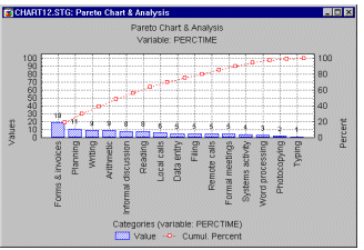
which simply amounts to a histogram showing the distribution of the quality loss (e.g., dollar loss) across some meaningful categories; usually, the categories are sorted into descending order of importance (frequency, dollar amounts, etc.). Very often, this chart provides useful guidance as to where to direct quality improvement efforts.
| To index |