Lab Scripts and Data
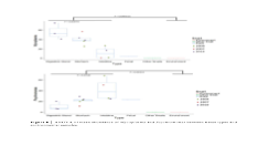
##ANOVA Analyzing Mycoplasma and Psychromonas Proportions from Rubyspira Samples
##Created by: Amanda Zellmer & Shana Goffredi
##Date Created: April 15, 2016
#Read in Data
setwd("C:/Users/xxxx")
Myco <- read.csv("C:/Users/xxxx/MycoplasmaProp.csv", header=T, sep = ",")
Myco.sub <- subset(Myco, Snail == "Ruby" & Type != "Fecal")
##ANOVA Mycoplasma Proportions
aov.out <- aov(Myco$Mycoplasma ~ Myco$Type)
print(aov.out)
summary(aov.out) #prints p-values!
#Plot Mycoplasma proportion Data in a Boxplot and show the data points
ggplot(data=Myco, aes(x=Type, y=Mycoplasma, color=Snail))+
geom_boxplot(outlier.shape = NA)+
geom_jitter(position=position_jitter(0.4))+
theme_classic(base_size = 20)
Below are scripts for :
-
1.generating ANOVA comparisons of microbiome communities, and associated box plots (click ANOVA_script2.txt for script)
-
2.generating PCA plots of microbiome communities
(click PCA_script.txt for script)
-
3.QIIME processing for barcode sequencing
(click QIIME_processing_Aug2016.docx for commands)

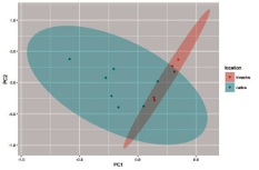
##PCA analysis of 16S rRNA sequence data for environmental microbiology
#Open Required Packages
require(vegan)
require(ggplot2)
require("ggfortify")
#Read in the Data Files
#Best to Save Data as CSV
#Factors Sheet Can Distinguish Location, or Tissue for example
#Run PCA Analysis
limpet.pca<-rda(limpet.t)
limpet.pca
limpet.pca2<-prcomp(limpet.t)
print(limpet.pca2)
summary(limpet.pca2)
plot(limpet.pca2)
limpet.pca2.out<-as.data.frame(predict(limpet.pca2))
plot(limpet.pca2.out[,1],limpet.pca2.out[,2])
#Color Code Data Points by a Factor of Interest (for example, Tissue Type or Location)
limpet.pca2.out$Sample <- as.factor(rownames(limpet.pca2.out))
limpet.pca2.out2<-merge(limpet.pca2.out, factors, by="Sample")
plot(limpet.pca2.out2$PC1,limpet.pca2.out2$PC2, col=limpet.pca2.out2$swablocation)
#Label Data Points, Space Properly to Avoid Overlap
ggplot(data=limpet.pca2.out2, aes(x=PC1, y=PC2, col=swablocation)) +
geom_point()+
geom_text(aes(label=Sample), hjust=0, vjust=0, check_overlap=T)+
#Add Key, Add Theme for Looks
theme_classic()
#Plot PC1 and PC2 with groups framed and with the vectors shown
#This shows circles around the factor you have selected for
#check out this website: http://rpubs.com/sinhrks/plot_pca
autoplot(limpet.pca2, data = limpet.pca2.out2, colour = 'swablocation', frame=TRUE, frame.type = 'norm')
#since the axes are so large, you can't see the loadings vectors which are orders of magnitude smaller.
#Restrict the x and y limits of the plot above to zoom in on the loadings vectors
autoplot(limpet.pca2, data = limpet.pca2.out2, colour = 'swablocation', loadings = TRUE, loadings.label=F, xlim=c(-1,1), ylim=c(-1,1))
#we can also extract the data directly
limpet.loadings <- as.data.frame(limpet.pca2$rotation)
limpet.sort.pc1 <- sort(limpet.loadings$PC1)
limpet.sort.pc2 <- sort(limpet.loadings$PC2)
#view top 10 species from PC1
subset(limpet.loadings, PC1 <= limpet.sort.pc1[5] | PC1 >= limpet.sort.pc1[length(limpet.sort.pc1)-4])
subset(limpet.loadings, PC2 <= limpet.sort.pc2[5] | PC2 >= limpet.sort.pc2[length(limpet.sort.pc2)-4])
}

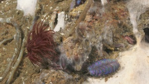
16S rRNA barcoding data from our expedition on the RV Falkor in 2018.
Samples include sponges, anemones, xenophyophores and a xenoturbellid.
Click Falkor_OTU_table.xlsx for the dataset